24.04.2025
Author: Elio Haas
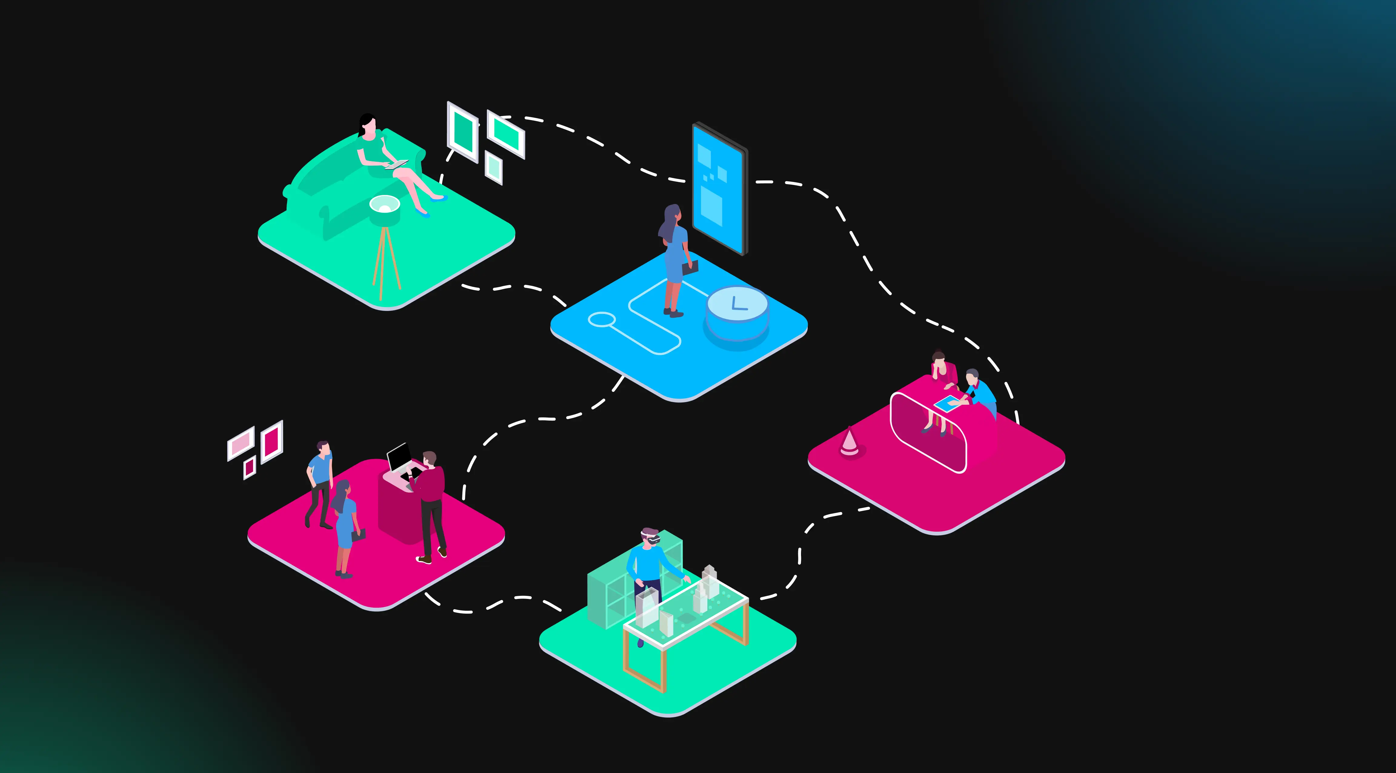
The digital landscape and its touchpoints are evolving rapidly – and with them, the expectations for an online experience that is intuitive, efficient and on-brand. Our goal for the relaunch of ukb.ch was clear: to create a modern, functional website that guides users to the right place, no matter their journey or level of knowledge. The result is a platform that is visually appealing and offers a personal, intuitive experience.
From Idea to Vision – Building a Product Vision Board
The foundation of this relaunch was the creation of a shared and clear understanding of what the new website should achieve. Through physical workshops, we developed a Product Vision Board based on core values that reflected both the company’s strategic goals and the needs of its users. It was not just a creative but also a strategic process that brought all stakeholders together. The guiding values – modern Uriness, intuitive guidance, and independent yet personal – served as the foundation for the project, aligned with the brand promise: «Our Uri. Our Bank.»
Laying the Foundation – Understanding the Basics
Before jumping into design, we first needed to build a strong foundation: a deep understanding of our target groups and their needs. Experience shows that only those who truly understand their users – their goals, their questions, their pain points – can create websites that offer real value.
The Value Proposition Canvas was key here. Using this tool, we systematically mapped the challenges, expectations and goals of our target audiences and aligned them with the value of our offering. This helped us pinpoint the intersection between user needs and our services.
The result: users recognise their personal situations on the site and find helpful answers quickly and independently. They feel supported and seen – yet empowered to find their way on their own. Through user testing, we validated these structures. For example, the defined structure for opening a mortgage was tested, improved and fine-tuned based on user feedback.
Focused Structure – Funnel-Based Design Principle
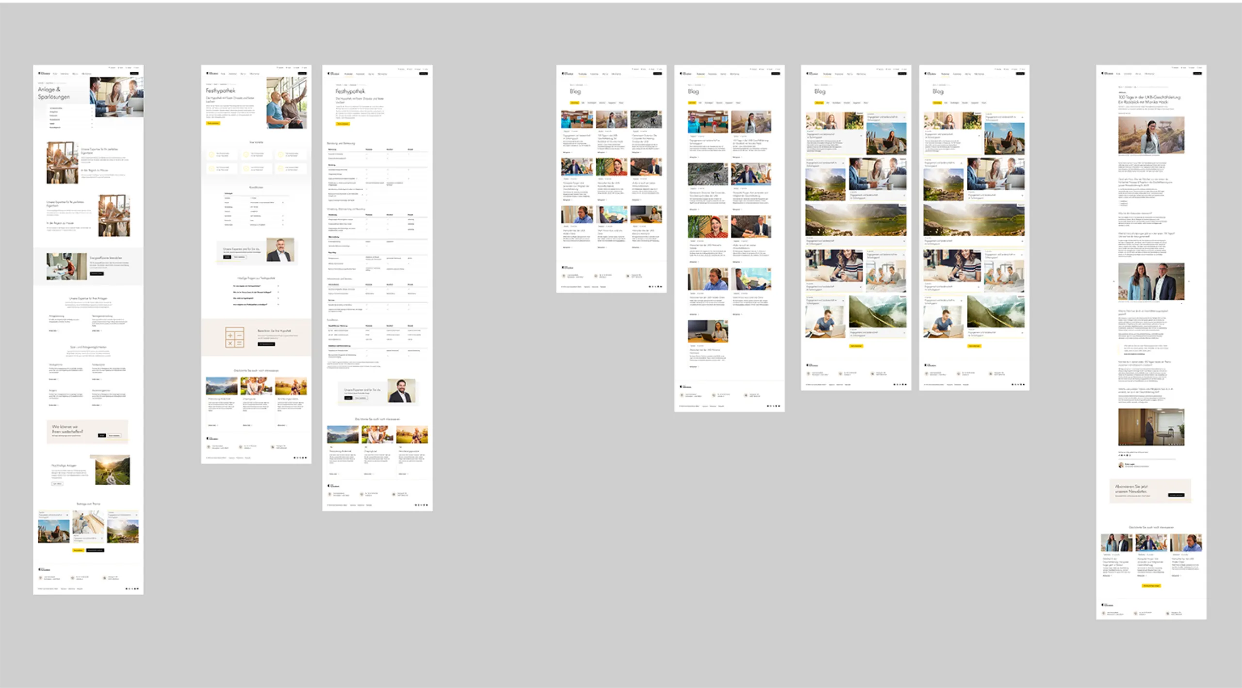
The next step was to develop page types based on the funnel-based design principle. These page types were designed to support users in their specific phase of the customer journey – creating clarity and orientation without limiting the diversity of content.
In this funnel-based approach, information is structured so users are seamlessly guided through the funnel stages and corresponding levels of detail. For instance, in the area of bank accounts: general information is in the top funnel, account types and comparisons sit in the middle funnel, and the actual product sign-up happens in the bottom funnel. The aim is to display only the content that’s relevant and helpful to each user.
This structure was translated into a modular CMS setup, allowing content to be flexibly mapped to each journey step. UKB can now independently create and manage content tailored to each funnel stage.
Users at the Core – Component-Based Development
We placed special emphasis on the development of individual components. Every interaction, function and visual element was designed with user needs in mind. The key questions guiding us: What answers are users looking for? What do they want to achieve?
Page types and components were created based on the Product Vision Board and the funnel-based design. This ensured a consistent user experience across the entire website, grounded in a strong vision and values.
The component library was built to present relevant content and interactions in the most effective way. Targeted micro-animations further enhance the user experience.
A clean and simple design language helps users intuitively understand functions and navigate the site with ease. Every element and interaction is built to match user expectations and habits.

Digital Brand Transformation and Accessibility
UKB’s local roots and Urner identity are key to its brand and were thoughtfully integrated into the new website through a modern expression of «Uriness». The result is a timeless design that blends local pride with digital clarity – creating a trustworthy digital space for users.
The website was developed in compliance with WCAG 2.1 AA guidelines. High contrast, accessible navigation and assistive technologies ensure the platform is usable and inclusive for all customer groups.
Interested in an exchange on the topic of «Website-Relaunch»?
Contact Roger:

Conclusion
With this relaunch, we created a website defined by a strong vision, thoughtful design and unwavering user focus. As a key touchpoint in the customer journey, it simplifies consultations and offers intuitive, consistent guidance – with a distinct touch of Uriness.
Learn more about user experience
Blog Post: «Seamless Customer Experience»

Blog Post: «Design with sense»